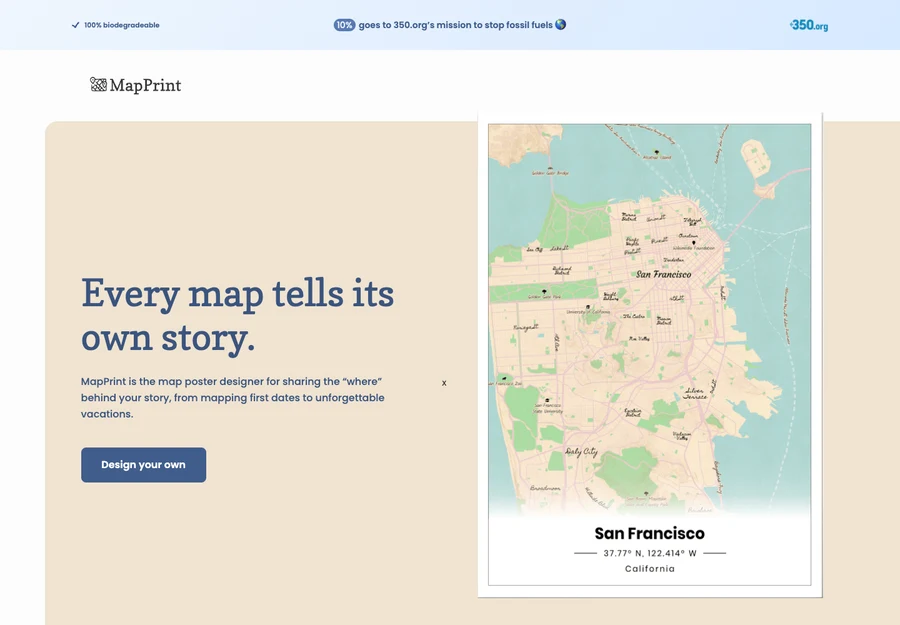
Started in 2020
The first version
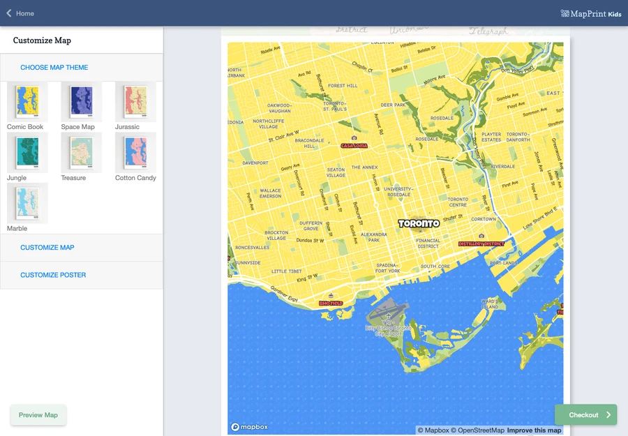
A web map maker for finding a place and choosing a view to keep.
Website shown from our 2023 archive.
Places matter
Waterloo Atlas Co. creates illustrated maps of neighbourhoods, towns and the places people care about. We combine real geography with thoughtful design to make maps that feel familiar, personal and worth keeping.
Explore our maps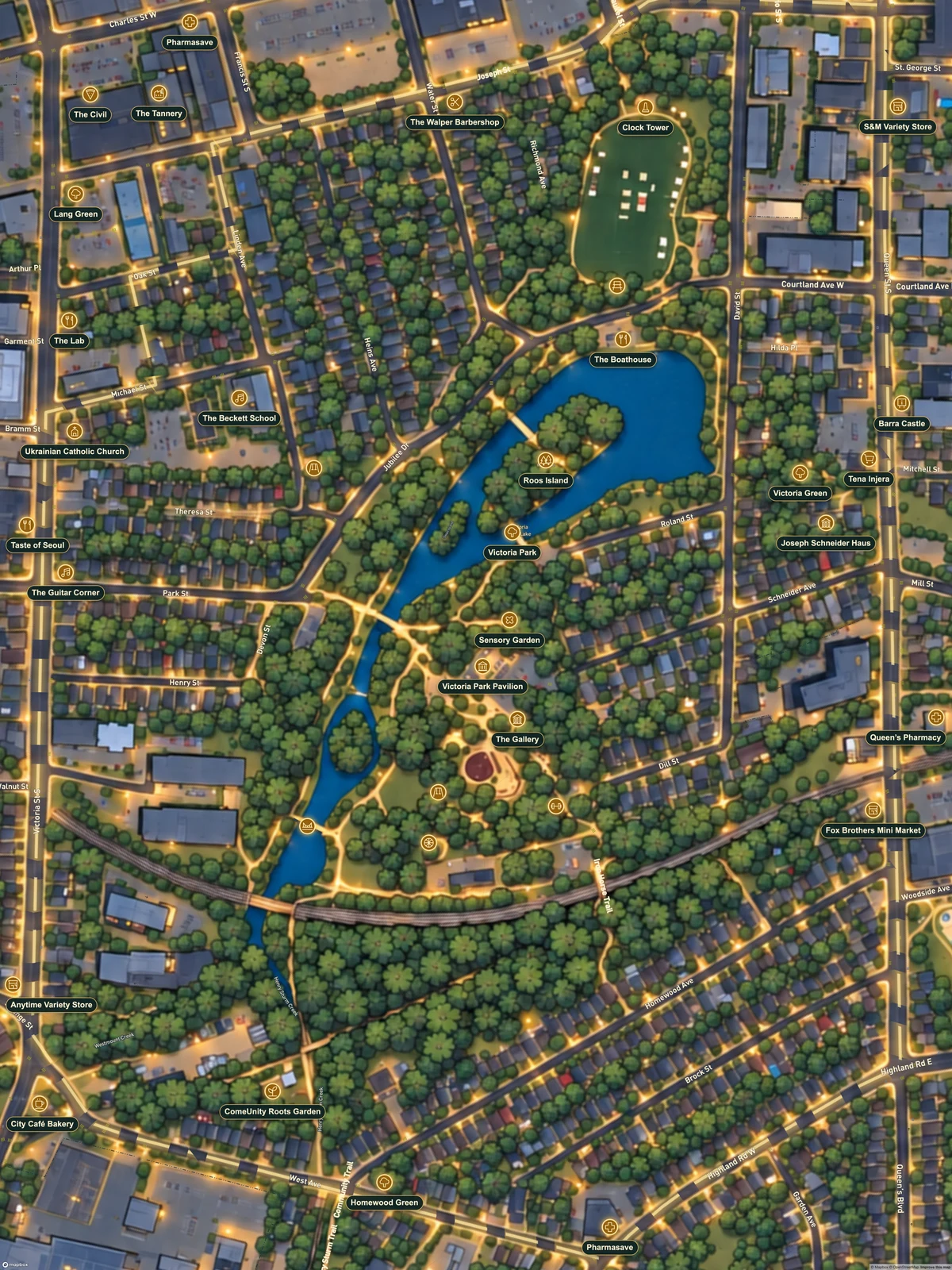
For new satellite-based stylized computer renderings, we overlay mapped water bodies at 75% opacity to guide shorelines, lakes and rivers. The chosen theme supplies the finished colours and textures. We review the result against the source geography.
A family connection
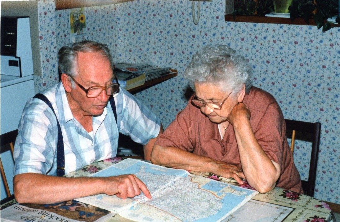
An interest in maps has always been present in our family. Opa would spread a map across the dining room table, trace the roads he had travelled and share stories of the old country.
Maps gave those stories a place. That connection between people, memories and geography is part of what we bring to Waterloo Atlas today.
From ideas to maps
Since 2020, we’ve been building, experimenting and refining our maps.
Started in 2020
A web map maker for finding a place and choosing a view to keep.
Website shown from our 2023 archive.
Exploring styles
Different themes and looks brought a little imagination to familiar streets.
Adding detail
Place icons, clearer labels and illustrated landscapes helped bring local details forward.
2026 and beyond
More neighbourhoods, towns and seasonal ideas, with new directions still taking shape.
From our archive
From the first web map maker to playful worlds and illustrated landscapes, each experiment helped us find a new way to tell a place’s story.
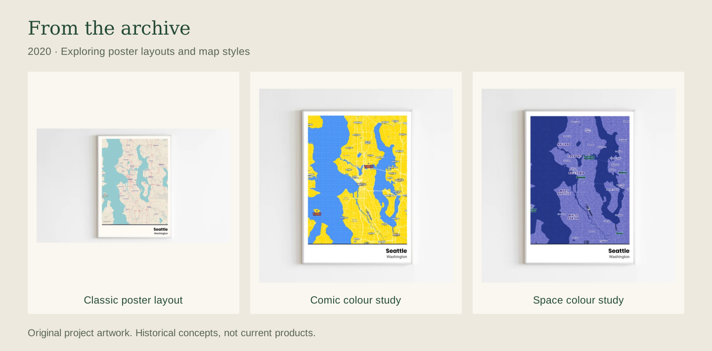
Captured locally from the December 2023 website source. Historical designs and wording.
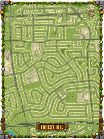
Our six kids’ map themes, shown here in Forest Hill.
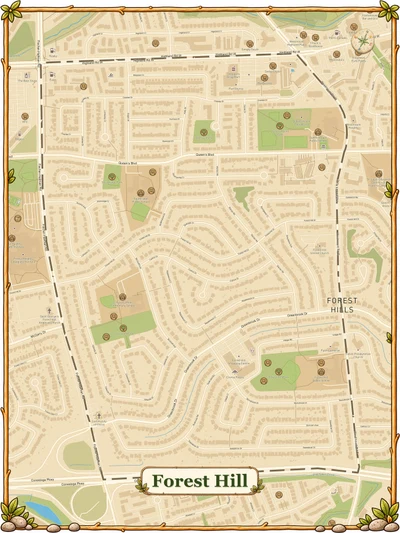
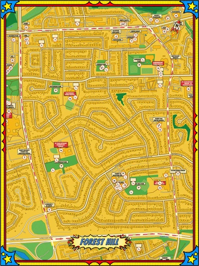
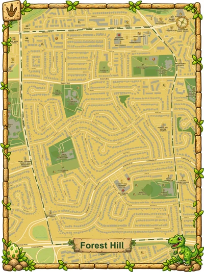
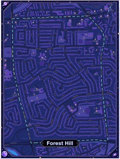
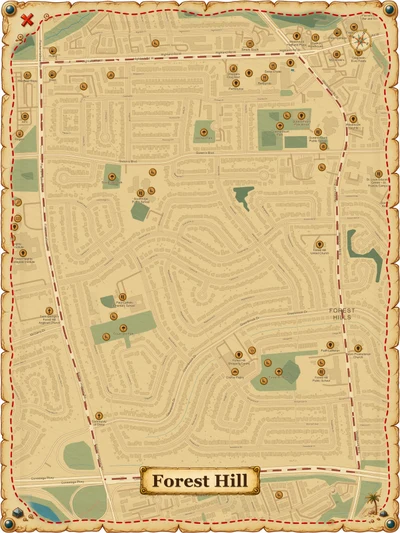
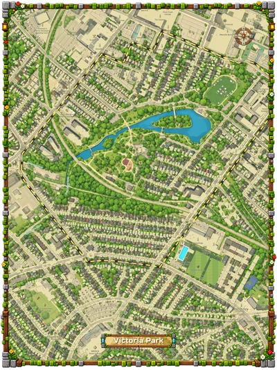
An illustrated landscape
This early Victoria Park map brought stylized computer renderings together with streets, labels and place icons. It opened up a more expressive direction for familiar places.
Earliest saved Video Game 2.0 render · September 23, 2026
Inside the design process
We explore a visual direction, from quiet landscapes to playful worlds. Reference images and small studies help set the mood.
We decide how streets, paths, water, buildings and green spaces work together, and which details deserve emphasis.
We balance land, water and road colours so the theme feels cohesive and the map stays easy to read.
We compare fonts, sizes and spacing for streets and place names. Each label needs a clear place in the hierarchy.
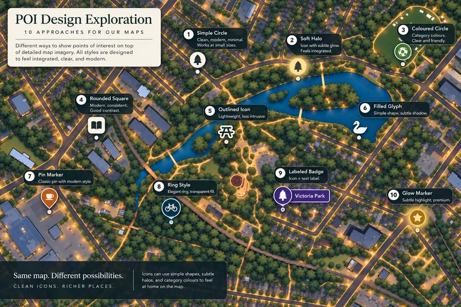
We select points of interest and develop their symbols. Shape, scale and placement help parks, cafés and landmarks stand out.
We try headings, plaques, ribbons and borders, then review the full print to refine how every part fits.
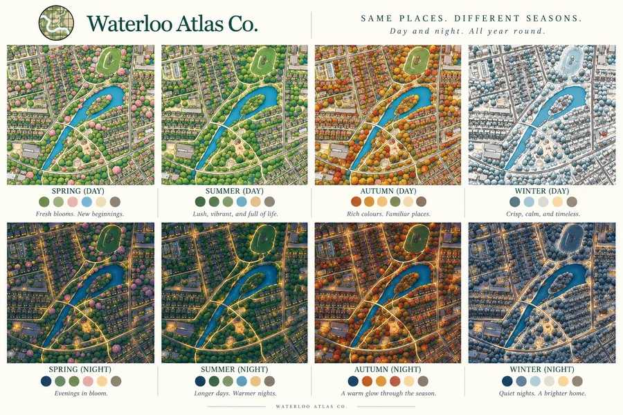
We keep exploring how a map can feel: a quieter symbol, a change of season, the warmth of evening light. These concept boards are studies, not finished maps or available product options.
We compare shapes, contrast and labels to see how a park, café or favourite stop can be easy to find.
View concept board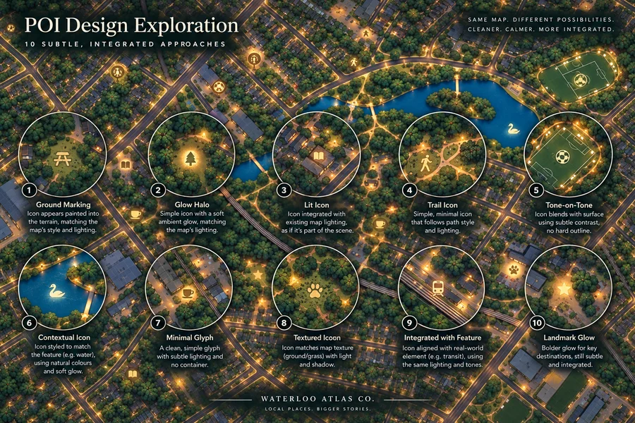
Could an icon feel at home among the paths, trees and lights? These studies explore softer ways to bring places into the scene.
View concept boardSeasonal colour and evening light can change how a familiar place feels. We explore these variations side by side.
View concept boardA closer look at place icons
Each map has its own visual language. Compare fine outlines, solid symbols, pins and illuminated badges, with a different treatment in every view.
Eight different treatments on saved basemap artwork, before place icons and labels are added. Illustrative placements, not a list of available map options.

A closer look at lettering
The same names, set six ways. Compare how each font shapes a park name, a street label and the quieter lettering over water.
Font studies on clean map artwork. Illustrative label placements, not available product options.
Still exploring
We’re continuing to explore new locations, styles and ideas, with the same goal: to create maps that help people see and appreciate the places that matter to them.
Find a place that matters to you